
I know I said we’d want to redecorate this room at some point
It should come as no surprise that I like reading. And books. And any art that involves either is immediately interesting to me.
For the hobby-/guestroom we had planned to get a Hemnes daybed from IKEA, furbish it with proper mattresses and quite a few pillows and a good reading light, so as to cater for guests (hence the essential “good mattress”) and reading (pillows and lamp, though the essentialness is a bit overlapping, obviously). The nice people of IKEA decided to have a 30 % sale on Hemnes this week, so we now have one Hemnes flatpacked on the floor, waiting for this weekend when we plan to move the lass into her new room, thus freeing up the space in the would-be guestroom.
Over the daybed, I’m planning to frame reading related “things”. I have som old (well, late 90’ies) ads from Waterstone’s (that I just LOVE), and I have one or two prints purchased off Etsy. I would like some more of the latter, though, so today I’ve been browsing, and tomorrow, once I’ve had time to consider which ones I really like the most, I’ll be putting in a few orders.
Here are some of the ones that immediately appealed to me:

“The reader” by Majalin

“Girl reading” by Belafonte (Emma Leonard)

“The boy who liked to read” by TheExtentofSilence

“One Story More” by trafalgarsquare

“Books can take you anywhere” by TheLittleFox
 “Reading is rad”/”Girl in green socks” by Artisjustfrozenmusic ( Carla Thursday)
Since it’s expected that the lass will use the space as well as us “grown ups”, I quite like the idea of mixing the styles a bit, rather than sticking to a more coherent collection. Since they have a common theme, I think they’ll work together anyway.
Have you seen any reading-themed illustrations lately? Please let me know in the comments, I’d love to get some tips for more candidates.

I got some art up on the wall in the kitchen. This wall is concrete and h*ll to make new holes in (we had to to anchor the whisky cupboards on the other side), so I just used the nails the previous owners had left. It works, though I would have rearranged the pictures (and lined up better) if I could do so easily. As it is, I suspect this is how it will remain.
The artwork is by various Trondheim-based comic book writers/artists (most by Mads Eriksen), and was purchased a few years back at an event in aid of a local comic showcase magazine. The husband had to work quite hard to convince me to stop at four, as they were (I thought) ridiculously cheap. The two in colour went for 300 kr, as far as I can remember, with the b&w ones going for less. Bargain!
The table and the one chair you can’t really see are inherited. My brother-in-law and his fiance had it before, and they painted it this dark blue colour, which is quite nice. However, especially on the table top it is quite worn by now. Also, the set (we had five more chairs, after some breaks I think we have four left) are originally teak (or at least teak-coloured), and I’ve been meaning to try paint stripper on one chair since we got them five years ago. Perhaps I’ll get around to it someday… They badly need recovering, anyway, so it would make sense to do both.
Someone, I no longer remember who, linked to Mattias Adolfsson a while back, and I’ve had his blog in my reader ever since. At some point I will give in and buy something from his Etsy store, but as of now I am content with following the blog. Lately there’s been some storytelling going on, and this last series makes me giggle and hug myself with glee.

I spent the weekend alone, having sent the husband and the lass off to Hitra in order to get some peace and space to tidy/clean/organise at home to make the change from a crib to a “big bed” possible in the lass’ room. It was a busy weekend.
Saturday morning, however, I took some time out to visit an exhibition whose flyer has been on the fridge since I picked it up last June. Recycling the Looking Glass – Trash Art – Found Objects – I thought it was at Kunstindustrimuseet and went there first, however, it was at Trondhjems Kunstforening. To be honest, it was kind of disappointing. There were a couple of good pieces though. I liked this:
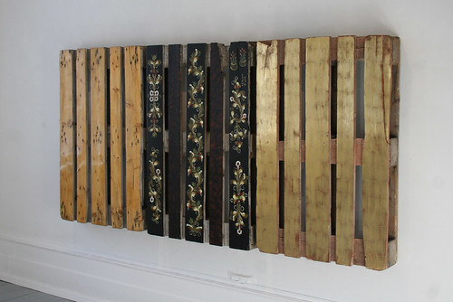
Which I think is by Vigdis Haugtrø & Johannes Franciscus de Gier and called Triptyk, though the information sheet was only partly informational, so I might be wrong. There was also a video of leaf-cutter ants with pieces of paper with various international symbols interspersed with the leaves, which I’m pretty sure was Coexistence by Donna Conlon (and in fact, Google has just confirmed this – the portfolio page describing the video is here). Anyway, that was good, too.
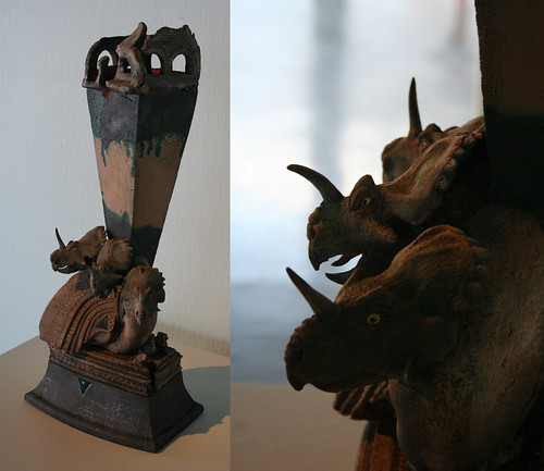
After seeing the trash, I went back to the Nordenfjeldske Kunstindustrimuseum to see their exhibit, which was a showcase of their acquisitions over the last two decades.
Just around 1989 when this sculpture by Chuck Wissinger was made, my brother was dinosaur mad. He would have loved it. I rather like it now.
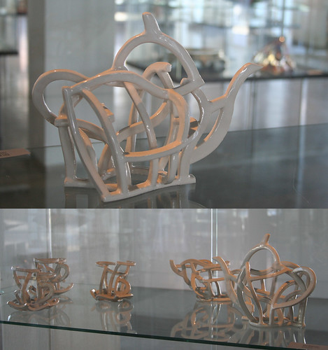
The Tea Set by Ken Eastman fascinates me.
And I wouldn’t mind a full set of plates by Paul Scott.
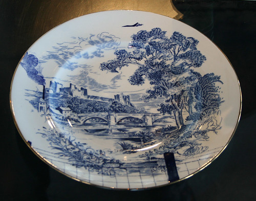
The latter, however,is the only piece which really comfortably fits the “decorative arts” tag for me. As Wikipedia says “some distinguish between decorative and fine art based on functionality” – I do. The plate, therefore, pleases me more. But I do like the tea set.