Great quote from Kermit the Frog:
Always be happy. When people are in a bad mood, the last thing they want to do is hang around with happy people.
(via)
Great quote from Kermit the Frog:
Always be happy. When people are in a bad mood, the last thing they want to do is hang around with happy people.
(via)
I’ve been listening to this today:
Which seems appropriate, what with what’s happening in Japan. I guess most of you heard of the bloggers’ day of silence on Friday, which I guess I kept, but it only really makes sense if you normally post every day (which I’m nowhere near doing). However, I would, naturally, suggest that we all pitch in with what we can. My favourite charities for this kind of thing would be:
or
Leger uten grenser – Médecins Sans Frontières
Whichever charity you choose, though, I suggest you make a general donation rather than one earmarked relief for Japan. Not that I don’t think Japan needs relief, by all means, they do, but the charities will route money that way anyway. The problem with earmarking is that if, for one reason or another, they are not able to use the money for the earmarked course, the earmarking means they can’t use it elsewhere. Say the political situation makes it impossible (not so likely in this case) or logistics means they can’t get the right sort of help there (more likely) or they get more money in the earmarked fund than they actually need (it happens, you know) then the charities are not legally allowed to use it elsewhere. Which means they can end up with a big sack of funds and thousands of worthwhile projects (clean water wells in Africa, starving kids in Pakistan, homeless people in New York) and no way of routing the money where needed. I know this happened in some cases after the tsunami in 2004.
Just my penny’s worth for today.
Så god at jeg burde kommet på den selv ;)
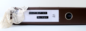
Med et lekent sinn har startet en bruktbutikkguideblogg, som ganske enkelt heter Bruktbutikkguiden. Genialt, spør du meg. Og, ja, jeg skal bidra med de jeg vet om så fort jeg får tatt noen bilder.
This awesome box has moved in with us today:
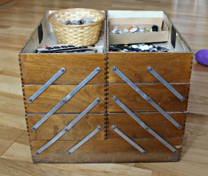
Purchased from Urban Retro, it’s a cornucopia of vintage buttons.
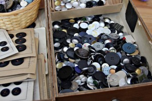
Quite a lot more than I’ll ever need, I’m sure.
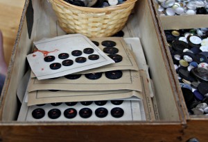
Quite a lot of them are still on cards, actually. I’ll probably put some up for sale at some point, if I ever get around to stocking my Epla-shop, for example. But I’m keeping the box. Mine, all mine!
I’ve pinned this as well, but just have to repeat it here. I love, love, love this interior:
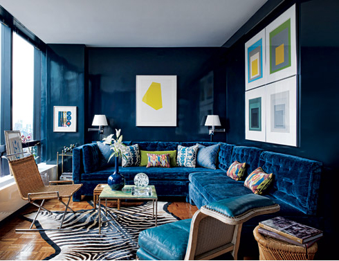
I’d change the artwork (not a big fan of non-figurative art, on the whole) and though I think the zebra skin rug looks stunning I wouldn’t actually want a real one on the floor, but a BIG yes to those laquered walls and the frankly gorgeous sofa.
More detail in the article in Architectural Digest.
(via)
I seem to remember promising to post something about the Gambia photobook once I’d received the finished product. Which I did a couple of weeks ago. And I finally got around to taking pictures of it in daylight last week. So. Here goes, prepare for rather a lot of images:
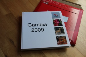
I sort of forgot that I needed a cover. So I ended up just pulling out four random images that I’d not had occasion to use inside the book and plopping them into the spots suggested by the default layout. With hindsight I should have spent a bit more time investigating the options, I’d probably have preferred another base colour than white, for example, but it works, and I guess that’s the important thing.
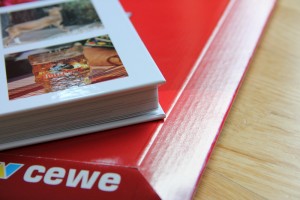
I ended up with close on 80 pages, and it’s printed on photo paper which makes it even thicker. However, it’s slimmer than I feared, I was a bit worried that it would be so thick as to be unmanageable, but it’s not. Far from it. It feels hefty and lovely, but is not so heavy that you need a reading table.
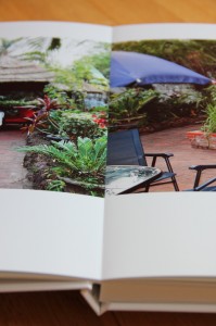
Another benefit of the photo paper version: The two facing pages are actually printed on one large sheet, and the sheets are glued back to back to create the book. This means that the book opens completely and no part of the page is lost “in the crease”.
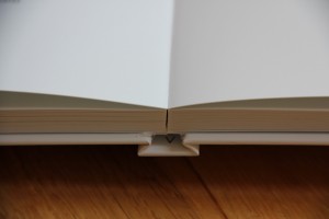
It also lies flat on the table (or floor in this case). No need to hold it open.
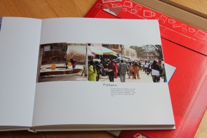
I’m normally more of a maximalist than a minimalist, but just when it comes to photos I find I like as little noise as possible around them. I considered serveral design options for this album, and was planning, at the very least, to choose a colour scheme that I’d use for a few frames, titles and brush swirls. But once I started pulling together the pictures, I realised they worked so well on their own that embellishment would distract rather than add, so I discarded the idea.
The one digital scrapbboking supply I used was a set of templates called “Off to Press” by Paislee Press, available at Oscraps. The templates are for an 8×10 album, so I’ve gone through them and resized them to 12×12. I’ve also moved photo and text spots around a bit on quite a few of the pages, as well as resizing or even duplicating photo spots as needed. I really love this template set, as it helped me keep the look reasonably consistent and encouraging copious amounts of white space while being simple enough to be exceedingly flexible.
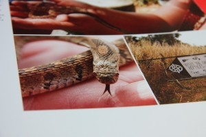
I’m really glad that I went for the photo paper option and didn’t fall for the temptation to save a few kroner by choosing a less expensive format. The clarity is really outstanding, any blur in the images is my fault entirely.
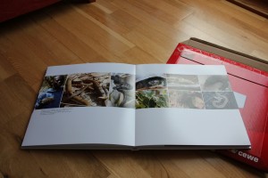
The other supply I used was a couple of actions from Pioneer Woman’s free action sets. Every image has had either “Boost” or “Define and sharpen” run on it, though on some I’ve reduced the opacity of the action layer(s) to avoid an overly processed look. In a few cases I’ve also used “Slight lighten”. Actions are a great way to get quick results for us lazy people, and I don’t think I’d have been able to finish the album on time without them.
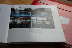
I normally date all my digital pages (with the date of the photos/subject, not date of creation), but since this is a cohesive album of one week’s trip, I only kept the date on the first page for each day.
All in all, I’m really thrilled with how this turned out. I had a serious attack of “Squee!” when I unwrapped this. The book, by the way, is printed at Japan Photo, who use a system called CEWE, which I suspect is available through other chains in Europe also, though I don’t know for certain.
Now all I have to do is get all my other photos into proper photo books. Yup. Well, one step at a time…